Working with numbers
- Agnes Sopel

- Dec 8, 2021
- 11 min read

Statistical techniques
Raw data are seldom information and they need interpretation. Then, the interpretation needs to be communicated.
Transforming data into information is a delicate art. Sometimes you may need to recognise the data so that patters can become clear. You need to interpret the implications of these patterns and and judge how much reliance to place to draw conclusions.
Understanding of statistical techniques is fairly rare. Moreover, its absence leads to flawed decisions.
If you are simply interested on how equations can be a help, keep reading.
Statistics is all about making data informative. It is common that it is ignored these days.
You are coming across all sorts of numerical evidence throughout your life. Therefore, you need to know what conclusions you can safely draw from the data. The skills of making conclusions from numbers is vital is all areas of work and day-to-day life. Many organisations are involved into risk management, for which the understanding of probability is essential.
Such assessment is based on sampling, distributions and probability which underline the techniques. Graphic representations of data are also very useful to make decisions and/or solve problems.
Mode, median and mean
When we have a set of numbers, we want to try to understand them in more details. Some of the initial calculations we might carry out are:
* The mode - the value that occurs most often,
* The median - the middle value,
* The mean - the average.
These can often be used to make sense of a lot of data. For example, change in a performance.
To find a mean of a set of numbers, we add them together and divide the result by the number in the sample.
The median is the middle value in a list of numbers when they are placed in numerical order from the smallest to the largest. If there is an even number of numbers, take the two middle numbers add them together and divide them by 2 to give one value. This value becomes the median.
The mode value is the most frequently occurring value in the list of numbers. To find it, sort the list of numbers into numerical order. You can than identify the most common number.
The range of a set of a variables is the number between the smallest and the largest number in a set.
When analysing sales data, for example, we could look at the mean, which could tell us the average sales per month, but that can be influenced by one very large or very small sales performance one month.
If we look at the median, we can see the mid point in sales in any month.
If we look at the most common sales (mode) that may indicate that there is a common sales achievement each month.
When we gather a data, we need to understand what it is telling us.
Correlation coefficient
We also may want to compare one set of data to another, For example, we might want to find out on whether there is a relationship with an amount spent on marketing and the sales.
We may want to find out whether the increased spent on marketing increases sales.
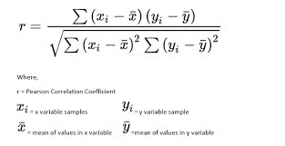
Than, we collect data spent on marketing each month and sales in that month. We want to know on whether there is a relationship between the sales and spent on marketing. To analyse this, we will need to calculate the correlation coefficient. This will determine, whether there is a significant relationship between the two sets of data.
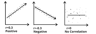
A correlation coefficient, falls between +1 (perfect positive relationship) and -1 (a perfect negative correlation).
The correlation is the most common and the most useful statistics. A correlation is a single number that describes the degree of relationship between two sets of data (variables).
Let's work through the example.
Let's assume that we want to look at the relationship between two variables, height and self-esteem. Perhaps we have a hypothesis that how tall you are affects your self esteem. Let's say we collect some information on twenty individuals. Height is measured in inches. Self-esteem is measured on the average of 10 1-5 rating items, where higher score means higher self-esteem.
We calculated the mean of height which was 65.4 inches. And the mean of self-esteem which was 3.755.By looking at simple bivariate plot we could immediately see the positive correlation. This means that higher scores on one variable tend to be paired with fairer scores on the other, and lower scores on one variable tend to be paired with lower scores on the other.
On an excel spreadsheet, we need to use the CORREL function.
Using graphs
Turning numbers into pictures can make them much easier to understand. We extract this way the sense from numbers.
Plotting graphs, for example, show relationships between two variables, typically x and y. The values depend on each other. You can, for example, show sales figures or production figures in this way. It is easy to spot trends and make comparisons. The graphs also allow to make tentative predictions. Where you have a clear trend in the lines as it is safe to say that they will continue. Therefore, if sales or production is growing, you could guess that the output will be similar in the next years, for example. Of course, they may be situations when the guess may not happen, but having the statistics will allow better planning and estimation. If the trends are fairly clear and gathered for a long period of time, the estimations will be even easier. If the lines, jumping around, somewhat, it will be difficult to say where it will go next. But, if there is an underlying trend, than you may be able to use the graph to get an idea of the area within which future points are likely to lie.
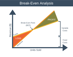
Breakeven point
One example of use of graphs is to fine the breakeven point for production. For example, you have information about a planned product. First, you will know what it cost to produce. There will be some cost you will incur regardless of the numbers you produce - the fixed costs. These might be buying a machine to do it or hiring an operator. Other costs, such as materials, will depend on the volume you produce - the variable costs. What you get back, will depend on how many products you sell at the price. If you know what you can charge and the sales volumes will vary. We often like to know how many products we need to produce so that they can start to make profit. This is called brakemen point.
If you plot the cost on the graph, the money on the y-axis and the number of units on the x-axis and showing another line of the income to be derived, assuming that you sell the number of products, you will find that the two lines will cross at some point.
Calculus
Calculus is one further area of mathematics you are likely to need. If you can plot observed values of variables and them see the shape of the curve it emerges you can work out the equation of the line which is close to that observed. Sometimes you will know the equation without needing to draw the curve. Than the equation, rather than the plotted curve will help to answer questions. Two important questions you are likely to ask:
- what is the rate at which value is changing at certain point?
- at what point on the curve the value is highest or lowest?
For straight lines, the rate of change is constant. For curved lines, the rate will be changing all the time. If you look at the shorter and shorter parts of the curve you will get closer and closer to straight line. When the part is infinitely small, you will have the rate of change at that point. If you extend this line you will see what that is. This line is the tangent of that curve, the line which touches the curve at only that point.
At the optimal point on the stress curve, where performance is highest, the tangent is flat. This will also be the case for the tangent for an U-shape curve at its lowest point. This suggests that, by looking for points where rate of change is zero, we can find the answer to the second question. Doing all this by eye is somewhat imprecise. Calculus, give you some rules for working out exact values. Differentiation is about finding rates of change to curves.
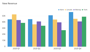
Bar charts
When plotting a chart you are plotting two variables - things which can take different values on the scales you show on the axes. The scales need to be ordinal scales so that you know how to draw and interpret them. A histogram also uses two ordered scales, though one is frequency. But if you could not order the categories you were counting you could not use the graph or histogram to make sense of a distribution of values.
Sometimes you may have one variable that is not measurable on a ordinary scale.
When you have one genuine variable and one set of categories you should use a bar chart instead. This still gives you a picture of figures and allows you to spot, for example, high and low values very easily, but does not imply that you might be able to find an equation which related the two sets of figures. If you have measured two or three things for each category, you may be able to get a feel for any strong relationship between these by plotting them side by side.
Because of the meaning of a chart depends so much on the scales on the axes, you must always take care to make the scale clear when drawing a chart or graph, and to note carefully the scales used when you are reading them. If you are using anything else than normal interval scale starting from zero, you may wish you alter readers to this in your text, in addition to labelling axes clearly in your diagram. The scope for giving a wrong impression is huge.
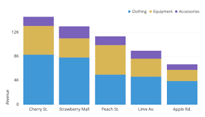
Sometimes bars are used to show proportions. If this is the case, the height of all the bars will be the same representing 100 percent. But within the bars there will be different colours of shading showing the different proportions of the various quantities making up the whole.
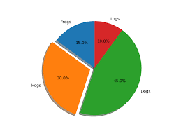
Pie charts
Another popular way of representing proportional data is pie charts. This has an advantage over the bar chart that it is clear the whole chart represents unity. The easy of generating computer-producing pie charts has led to their proliferation in reports, often in may colours or even 3D. Such charts are easy to understand, even for those who have difficulty with fractions. While pie charts are great as they have only few slices, they can become difficult to interpret once they contain a large number of categories. If you have more than four or five categories, it is better to use a bar chart, as lengths are easier to judge.
Measures of dispersion
The way in which the values you have obtained are spread out are also important for a number of reasons. You may simply need to know the range you can expect in order to plan for all possible situations. But more often you will be wanting to know how important differences between groups are and the importance of differences in means will depend on the variation in the data. Suppose one group you observed had an average value of some measure of 5 and another group had an average of 6 and you wanted to know whether there was a significant difference or have just happened to have come out that way on the day you measured. If all the values in the first group were between 4.5 and 5.5 and all the values in the second group were between 5.5 and 6.5, you might be surer about the difference than if numbers in each case were scattered about between 1 and 10. You therefore need some measure of this scatter of dispersion.
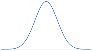
A bell-shaped curve on a chart is frequently found. It appears when you have a large population and and you are measuring a continuous variable. The curve may be taller or thinner or flatter. This will depend upon the scale you are using in any case. Common it is that it is called the "normal distribution".
Range
There are several measures of dispersion, the simplest is the range, the distance from the largest to the smallest measure observed. It is the most obvious indicator of the dispersion of a set of figures and the easiest to ascertain. But is has a fairly obvious drawbacks. Even more than one mean, it is susceptible to being distorted by one or two maverick figures. This may not be a distortion if you genuinely need to know the possible range. But if you are tying to get a big picture of a distribution than it might be misleading. Also you might not know the end of the distribution, because you used an "open" category.
Interquartile range
One indicator of spread that avoids these problems is derived by developing the idea of the median. Just as the median tell you the position of the middle observation, so you can find the middle of observations to each side of the median by treating each as a distribution and finding its median. These values will represent the positions one-quarter and three-quarters along the distribution and are called the quartiles. The distance between the upper and the lower quartile is called the interquartile range and tells you the range within which half your values are likely to lie. It is not distorted by the odd deviant value and its almost as easy to work out as the median.
The idea of quartiles can be extended still further, do deciles and percentiles. For example, you might be designing a car sit and need to know the range of adjustments to built in. It would not be much good to use the interquartile range. If you did, the seat would be uncomfortable for half of your potential customers. Equally, you would probably not want to design a seat that would suit every adult on the planet. It would be expensive and the small number of potential purchasers who are over 9ft and under 4.5ft do not justify the expense. For many such design situations percentiles are used, dividing the distribution into hundredths. And traditionally, the lower five percentiles and the upper five percentiles are disregarded. If you are at the outlaying end of the distribution, say one of the 5 percent shortest or 5 percent tallest people, you will have problems finding chairs, cars and whatever to suit.
Standard deviations
Standard deviations are used is a variety of situations as a measure of dispersion. If you want to know how representative your mean is. One way of finding the answer would be to work out the difference between each value and than mean and this values together and average them. You must be mindful, however, that some of the numbers may be negative and will cancel out the positive. You can get around this by ignoring the negative signs.
Drawing conclusions from figures
In talking about both graphic representations of data and numerical descriptions such as mean, median and mode, we are organising data in a way that creates patterns to see it clearer. Some thing may look pretty obvious from histograms or differences from different means from a sets of figures, they still need to be treated with caution. Most people assume that things are highly unlikely, but this generally proves wrong.
In collecting data to inform a decision to test at some hypnotists we can generally look at a sample for the population in which we are interested.
In drawing conclusions the nature and size of sample are important. If we did not choose a sample carefully, the data would be unrepresentative. If you try anything of a tiny number of people, you will find it hard to ensure that the results implied for the rest would work.
We also have to be aware that in each of the examples that data may also be imperfect.
People might say one thing when asked and do another when actioning something. Some may intentionally mislead the surveyor as they do not like surveys and questionnaires. Therefore, considerate caution is needed in making interfaces from a sample of imperfect data relating to more complex situations. And yet, this is the sort of data that we are normally using to provide information. Because this area is so important all types of statistical techniques has been developed to help drawing conclusions. Unfortunately, such techniques are often ignored and wrong conclusions are drawn.
Significance
Sometimes we need to know how likely things can happen "by chance". Statistical tests of significance give you an idea of this. They will indicate how often an extreme result would happen if there were no difference in population from which your samples were drawn, that is, how often would you expect to get a result "by chance". It is often expressed in "confidence level of XX %". Normally journals are prepared to publish results which are as significant as around 95% but not lower. When you are predicting the "direction" of the difference, rather than hypothesising that there would be a difference of some kind a smaller actual difference is sufficient to give you 95% confidence level in your result.

It is important to understand quantitative analysis for data analysis. Working with numbers contain a very broad spectrum of activities: from simple calculations to high level mathematics.
The aim is to analyse data that we can come across at work, so that you can make sense of it.


Comments