Unveiling Insights through Run Charts: Harnessing the Power of Medians for Process Improvement
- Agnes Sopel

- Aug 25, 2023
- 11 min read

In the realm of process improvement, data-driven decisions are key to achieving operational excellence. One valuable tool that aids in this pursuit is the run chart. Run charts help organisations visualise trends and patterns in data over time, enabling them to identify anomalies, monitor process stability, and implement targeted improvements. While mean values are commonly used in these charts, we will explore why the median is often a superior choice. We'll also delve into the concepts of mixtures, clusters, trends, and oscillations, and discuss how to create run charts using Excel.
Why Choose the Median for Run Charts?
In traditional run charts, the mean (average) value is often used as a measure of central tendency. However, the median offers a more robust alternative, especially when dealing with data that might be skewed or contains outliers. The median represents the middle value in a dataset when it's ordered from least to greatest. Unlike the mean, which is influenced by extreme values, the median remains relatively unaffected. This makes it an excellent choice for identifying trends and patterns, as it provides a more accurate representation of the central data points.
Defining the core elements
Before diving into the practical aspects of creating run charts, let's define some important terms:
Mixtures: Mixtures occur when data points from different distributions are combined. They can indicate variations in the process that might require further investigation to understand the underlying causes.
Clusters: Clusters involve data points that group closely together. These could be an indicator of natural variation or a sign of a specific process state.
Trends: Trends show the direction in which the data is moving over time. An upward or downward trend could signify an underlying process shift.
Oscillations: Oscillations refer to repetitive up-and-down patterns in the data. These might be caused by external factors affecting the process.
Creating Run Charts in Excel
Excel provides a user-friendly platform for creating run charts. Here's a step-by-step guide:
Collect Data: Gather the data points you want to analyse over time.
Organise Data: Arrange the data chronologically in Excel columns.
Calculate Medians: Calculate the medians for each time period using Excel's MEDIAN function.
Create Chart: Select the data, including time and median columns. Go to the "Insert" tab and choose a line chart.
Format Chart: Customise the chart by adding titles, labels, and gridlines.
Analyse Patterns: Observe the chart for mixtures, clusters, trends, and oscillations.
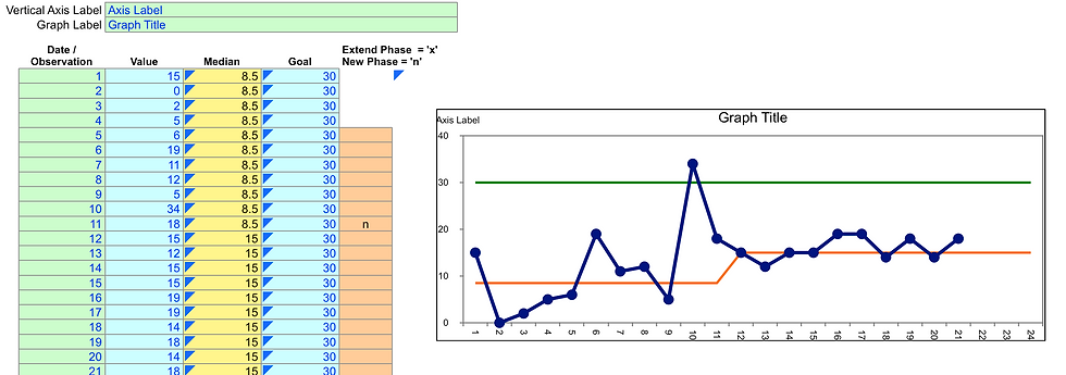
Source: https://www.sheffieldmca.org.uk/UserFiles/File//Run_Chart_Template.xlsx
Each observed pattern in a run chart holds significance for process improvement:
Mixtures
If you identify mixtures, investigate potential causes for the variability. It could highlight differing process conditions that require adjustments.

When mixtures are observed in a process, it indicates that the data consists of distinct subgroups with different characteristics. This could be due to variations in process conditions, changes in equipment, shifts in personnel, or other factors. Addressing mixtures requires a systematic approach to identify the underlying causes and determine the appropriate actions for process improvement. Here's what you can read and do when mixtures are seen in a process:
**1. Read and Study:
Quality Improvement Literature: Explore resources on quality improvement methodologies like Six Sigma and Lean. These methodologies often provide guidance on how to address mixtures and variations in processes.
Process Control Books: Look for books that delve into statistical process control (SPC) methods, which can help you understand the concepts of control charts, variability, and process stability.
**2. Data Analysis:
Data Segmentation: Divide the data into the distinct subgroups that are causing the mixtures. This could involve identifying time periods, shifts, or other factors that contribute to the variations.
**3. Root Cause Analysis:
Fishbone Diagram: Use a fishbone (Ishikawa) diagram to systematically identify potential causes of the mixtures. Categories can include people, process, equipment, materials, and environment.
5 Whys: Ask "why" repeatedly to dig deeper into the causes behind the variations. This helps you get to the root causes of the mixtures.
**4. Investigation and Solutions:
Process Mapping: Map out the process to understand how different steps or components might be contributing to the mixtures.
Process Observations: Observe the process in action to identify areas where there might be differences in execution or conditions.
**5. Hypothesis Testing:
Design of Experiments (DOE): Consider using designed experiments to systematically test different variables and their effects on the process.
Statistical Tests: Apply appropriate statistical tests to determine if there are significant differences between the subgroups causing the mixtures.
Examples of Interpretation and Use for Process Improvement:
Manufacturing Example: Interpretation: In a manufacturing process, mixtures might be observed in the output quality. One subgroup could be associated with a specific shift, while another subgroup could be linked to a different raw material supplier. Process Improvement: Implement focused training for the shift showing lower quality outputs and work with the supplier to ensure consistent material quality. This should lead to more consistent and higher-quality production.
Healthcare Example: Interpretation: In a hospital's emergency department, mixtures might appear in patient wait times. One subgroup could correspond to peak hours with longer wait times, while another subgroup might be off-peak hours with shorter wait times. Process Improvement: Optimize staffing levels during peak hours to reduce wait times, and implement strategies to ensure consistent patient flow during off-peak hours.
Software Development Example: Interpretation: In a software development process, mixtures might emerge in the time taken to resolve bugs. One subgroup could be related to coding issues, while another subgroup might involve communication breakdowns between development and testing teams. Process Improvement: Implement coding standards and practices to reduce coding-related issues, and establish clear communication channels and protocols between teams to address communication-related issues.
In each of these examples, addressing mixtures involves understanding the factors causing the variations, implementing targeted improvements, and continuously monitoring the process to ensure sustained positive outcomes. The goal is to enhance process consistency, reduce variability, and achieve more predictable results.
Clusters or Shift
Clusters could indicate process stability or shifts. Investigate the events surrounding these clusters to discern their implications.
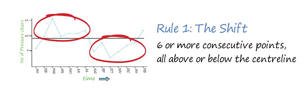
When clusters or shifts are observed in a process, it indicates a group of data points that are noticeably different from the surrounding data. This could be a sign of a change or a shift in the process conditions, equipment, personnel, or other factors. Addressing clusters or shifts requires careful analysis to identify the root causes and take appropriate actions for process improvement. Here's what you can read and do when clusters or shifts are seen in a process:
1. Read and Study:
Process Change Management: Learn about change management principles and methodologies. Understanding how to manage changes effectively can help you address shifts in the process.
Statistical Process Control (SPC): Study SPC methods to understand how control charts can be used to monitor and detect shifts in a process.
2. Data Analysis:
Segmentation: Segment the data around the clusters or shifts to isolate the distinct subgroups. This will help you understand what factors are contributing to the differences.
3. Root Cause Analysis:
Historical Context: Gather information about any recent changes or events that might have triggered the shift. This could include changes in personnel, equipment, materials, or procedures.
Brainstorming: Engage a cross-functional team to brainstorm potential causes of the shift. Use techniques like the "5 Whys" to get to the root cause.
4. Investigate and Solutions:
Process Mapping: Map out the process to identify areas where changes might have occurred. Look for discrepancies in procedures, inputs, or outputs.
Process Observations: Observe the process to identify any irregularities or deviations from standard operating procedures.
5. Data Validation:
Verify Data Accuracy: Ensure that the data used to identify the shift is accurate and reliable. Incorrect data can lead to incorrect conclusions.
Examples of Interpretation and Use for Process Improvement:
Retail Example: Interpretation: In a retail environment, a shift in sales data might indicate a sudden increase in demand for a particular product category, such as electronics. Process Improvement: Address the increased demand by ensuring sufficient stock of the popular products, adjusting staffing levels, and optimising inventory management processes to avoid stock-outs.
Call Centre Example: Interpretation: In a call centre, a shift could manifest as a sudden increase in call wait times during a specific time of day. Process Improvement: Investigate the underlying causes of the increased wait times. It might be due to reduced staffing levels during that time. Adjust staffing schedules to align with call volume patterns.
Financial Services Example: Interpretation: In a financial services organisation, a cluster might be observed in transaction processing times, indicating that a specific team is consistently taking longer to process transactions. Process Improvement: Analyze the workflows of the team experiencing longer processing times. Identify bottlenecks or inefficiencies and implement process changes or additional training to streamline their operations.
In each of these examples, addressing clusters or shifts involves understanding the factors causing the deviations, taking corrective actions to bring the process back to the desired state, and monitoring the process closely to ensure that improvements are sustained. The goal is to detect and respond to changes early, minimise negative impacts, and maintain consistent process performance.
Trends
Trends provide valuable insights into process performance changes. Identify when the trend started and look for corresponding process alterations.

When trends are observed in a process, it indicates a systematic and consistent movement of the data points in a particular direction over time. These trends can be upward, downward, or flat. Interpreting trends involves understanding whether the process is improving, deteriorating, or remaining stable. Here's what you can read and do when trends are seen in a process:
1. Read and Study:
Time Series Analysis: Familiarise yourself with time series analysis techniques. This field of study focuses on understanding patterns in time-ordered data, which is exactly what trends represent.
Predictive Analytics: Learn about predictive modelling and analytics to forecast future trends and make informed decisions based on the observed trends.
2. Data Analysis:
Calculate Rates of Change: Quantify the trend by calculating the rate of change over time. This helps you understand the magnitude of the trend and its impact on the process.
3. Root Cause Analysis:
Historical Data: Review historical data to identify events or changes that might have triggered the trend. Look for correlations between the trend and external factors.
4. Investigate and Solutions:
Process Mapping: Map out the process and identify key factors that might be contributing to the observed trend. Look for changes in inputs, procedures, or conditions.
5. Predictive Analysis (Optional):
Forecasting Models: Consider using forecasting models to predict future values based on the observed trend. This can help you plan ahead and take proactive measures.
Examples of Interpretation and Use for Process Improvement:
Website Traffic Example: Interpretation: In a website's analytics data, an upward trend in daily page views indicates increasing user engagement. Process Improvement: Invest in content creation, marketing, and user experience enhancements to continue attracting and retaining visitors.
Manufacturing Defects Example: Interpretation: A downward trend in the number of defects identified in manufacturing suggests improved product quality. Process Improvement: Identify and document the changes that led to the decrease in defects. Implement similar practices across other processes to maintain or enhance quality.
Customer Service Response Time Example: Interpretation: An upward trend in customer service response time suggests a slowdown in customer issue resolution. Process Improvement: Review staffing levels and workflows to ensure efficient handling of customer inquiries. Consider implementing chatbots or automation to improve response times.
In each of these examples, addressing trends involves understanding the direction and magnitude of the trend, identifying contributing factors, and taking appropriate actions to capitalise on positive trends or mitigate negative ones. Continuously monitoring the process and analysing the impact of interventions is essential to ensure the desired outcomes are achieved and maintained.
Oscillations
Oscillations might result from external factors impacting the process. Identifying these factors can lead to better control of the process environment.
When oscillations are observed in a process, it means that data points are following a repetitive up-and-down pattern over time. Oscillations can be caused by external factors, seasonal variations, or other periodic influences affecting the process. Interpreting oscillations involves understanding the underlying cycles and identifying the factors responsible for the repeating pattern. Here's what you can read and do when oscillations are seen in a process:
1. Read and Study:
Time Series Analysis: Deepen your knowledge of time series analysis techniques, which are well-suited for understanding and analysing oscillations.
Seasonal Decomposition: Learn about methods for decomposing time series data into its components, such as trend, seasonality, and noise.
2. Data Analysis:
Periodicity Analysis: Determine the frequency and duration of the oscillations. This will help you understand the cycle length and amplitude.
3. Root Cause Analysis:
Seasonal Influences: Investigate whether there are seasonal factors, weather changes, holidays, or other recurring events that might be causing the oscillations.
4. Investigate and Solutions:
External Factors: Identify external factors that might be influencing the process. These could include economic cycles, market trends, or regulatory changes.
5. Forecasting and Prediction:
Time Series Models: Consider using time series forecasting models to predict future oscillations and plan accordingly.
Examples of Interpretation and Use for Process Improvement:
Retail Sales Example: Interpretation: In retail sales data, oscillations in sales revenue might be linked to seasonal shopping patterns, with increased sales during holidays and decreased sales during off-peak periods. Process Improvement: Optimize inventory levels to match the anticipated demand during peak sales periods and implement targeted marketing campaigns to stimulate sales during slower periods.
Energy Consumption Example: Interpretation: Oscillations in daily energy consumption data for a manufacturing plant could be related to the production shifts. Energy consumption might be higher during production hours and lower during non-production hours. Process Improvement: Implement energy-saving measures during production downtime and explore opportunities to optimise energy usage during peak production.
Stock Market Example: Interpretation: In stock market data, oscillations might be associated with market cycles influenced by economic conditions, investor sentiment, and global events. Process Improvement: Investors and traders can use oscillations to identify potential entry and exit points for trades. Understanding the underlying causes of oscillations can guide investment strategies.
In these examples, addressing oscillations involves aligning processes and strategies with the cyclic patterns, understanding the external factors driving the oscillations, and optimising resource allocation to match the anticipated fluctuations. By doing so, organisations can improve efficiency, reduce waste, and better cater to customer demands during different periods of the oscillations.
What are the rules for interpreting a run chart
Interpreting a run chart involves understanding the various patterns and trends present in the data. While there aren't strict "rules," there are guidelines and principles that can help you derive meaningful insights from the chart. Here are some key points to consider when interpreting a run chart:
Data Collection and Timeframe:
Ensure that the data is collected consistently and accurately over the specified time period.
The time intervals between data points should be uniform.
Central Tendency Measure:
As mentioned earlier, consider using the median as the measure of central tendency for more robust insights, especially in the presence of outliers or skewed data.
Baseline:
Establish a baseline by plotting the median or other appropriate central tendency measure over time.
Patterns and Trends:
Look for patterns like mixtures, clusters, trends, and oscillations.
A mixture indicates variations or subgroups with different characteristics.
Clusters are groups of data points that are close together, suggesting consistency or change.
Trends show the overall direction in which the data is moving.
Oscillations are repetitive up-and-down patterns.
Shifts and Variability:
Identify shifts or sudden changes in the central tendency. This could indicate process improvements or deteriorations.
Assess the overall variability. A reduction in variability suggests process stabilisation, while an increase may indicate instability.
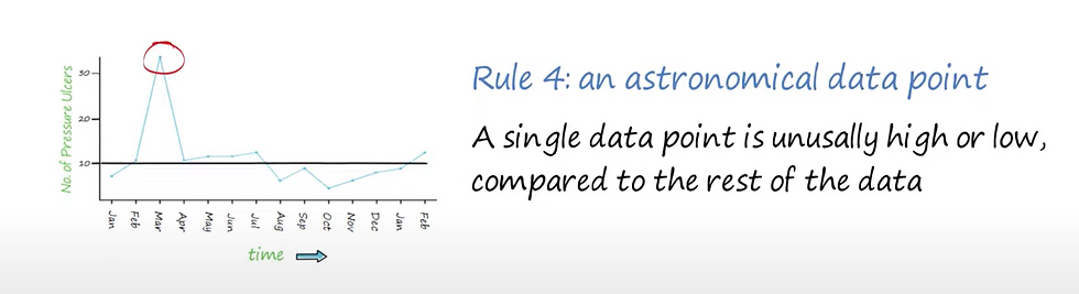
Outliers:
Pay attention to extreme values that deviate significantly from the general trend. Investigate the causes of outliers, as they might reveal important process anomalies.
Statistical Control Limits (Optional):
Depending on the level of sophistication desired, you can add statistical control limits (e.g., upper and lower control limits) to the chart. These help identify when the process goes out of control or exhibits unusual behavior.
Context:
Consider the context surrounding the data. Are there any external factors or events that could have influenced the process? Understanding these factors is crucial for accurate interpretation.
Cross-functional Collaboration:
Interpretation is often more insightful when done collaboratively with individuals who have different perspectives and expertise related to the process.
Actionable Insights:
The ultimate goal is to derive actionable insights. Based on the patterns and trends observed, identify potential causes and solutions for process improvement or corrective action.
Continuous Monitoring:
Run charts are not a one-time analysis. Continuously monitor the process and update the chart as new data becomes available to track the effectiveness of implemented changes.
Remember, the interpretation process is iterative and may require further investigation, experimentation, and refinement. The goal is to use the insights gained from the run chart to make informed decisions that lead to improved process performance and outcomes.
Conclusion
Run charts are indispensable tools for process improvement. By utilizing the median as the measure of central tendency, organisations can gain a clearer understanding of data trends and patterns. Understanding mixtures, clusters, trends, and oscillations empowers teams to make informed decisions and implement targeted improvements. With Excel's accessibility, creating and analyzing run charts becomes a feasible task for all levels of users. By embracing run charts and their insights, organisations can pave the way for continuous enhancement and success in their processes.
Bibliography:
HSE Ireland, "Run charts in quality improvement", Accessed from https://www.youtube.com/watch?v=ySbhsX-y8zE , Accessed on 26/08/2023


Comments